I felt like the vertical stripes used in the layout help in drawing the eye to the content of the blog while not taking away from it. The reduced opacity in the overlayed background image allows for a lot of customization in regards to color options for this theme with minimal effort.
Overall I chose this design due to the ease of use and customization aligned with the color choices and feeling that I wanted in my blog at the moment. The soft pinks bring a breath of ease and relaxation to me and help me to focus on what needs to be done.
For my social media use, I find that there are many pros and cons associated with the various sites and they vary greatly in usefulness depending on what you are looking to get out of them. One of the biggest things that you need to consider when looking to utilize social media is what kind of content are you looking to put out and/or consume.
With regards to my personal use of social media I tend to stick with ones that are easier to use and are more widespread in their use, namely Facebook and Twitter -- although I do have a few other sites that I am no longer active on. I use them to keep in touch with family and friends who I live far from as it is a good way to keep those you love close.
However, with my business use of social media, I tend to try to branch out to new sites as I can and heavily rely on Facebook and Twitter to get my information out. I occasionally utilize Instagram as I have an art business as well but I find Instagram a bit bulky and difficult to use at times compared to using Hootsuite to post across my Facebook and Twitter accounts seamlessly.

I agree with using Hootsuite, is it able to post on Instagram now? I remember it used to be able to, then stopped, so I stopped using it lol.
ReplyDeleteNice to meet you by the way, my name is JR, and I create personal development videos on YouTube. I spent the last few years pre-covid as a digital nomad in SE Asia, but am now back here going to school (obviously).
Good luck with your semester!
-JR
Hello Emilie,
ReplyDeleteYour color scheme provides a light, yet warm and relaxing feel for the reader. The "simplicity and cleanliness" of the design doesn't distract the reader from the blog itself. Well done.
In the past, like you, I have used social media to keep up with friends and family. Using it for your business is a great way to get yourself out there. I don't have a business. However, I provide tech support to people which I can not readily be physically available to. I am hoping to set-up some sort of platform for Q&A and to provide notifications.
Hi Emilie,
ReplyDeleteI like your approach to minimalism. Typically when I think of a minimalistic design I think of shades of white, brown, black, and grey. I like that you took the sleekness of minimalism, but added color. Good idea using vertical stripes as well, you’re right it does draw the eye downwards towards your post.
I’m excited to see how your blog changes throughout the semester!
Hello Emilie!
ReplyDeleteI really enjoyed reading about why you chose this theme for your blog. It sometimes is difficult to focus on content when there is to much going on with the page but you have provided us a minimalism layout. Its very effective, I also think that you adding in a GIF was effective and make your page seem a lot more welcoming. I have never heard of Hootsuite before, I may have to check that out as my social media presence is extremely lacking.
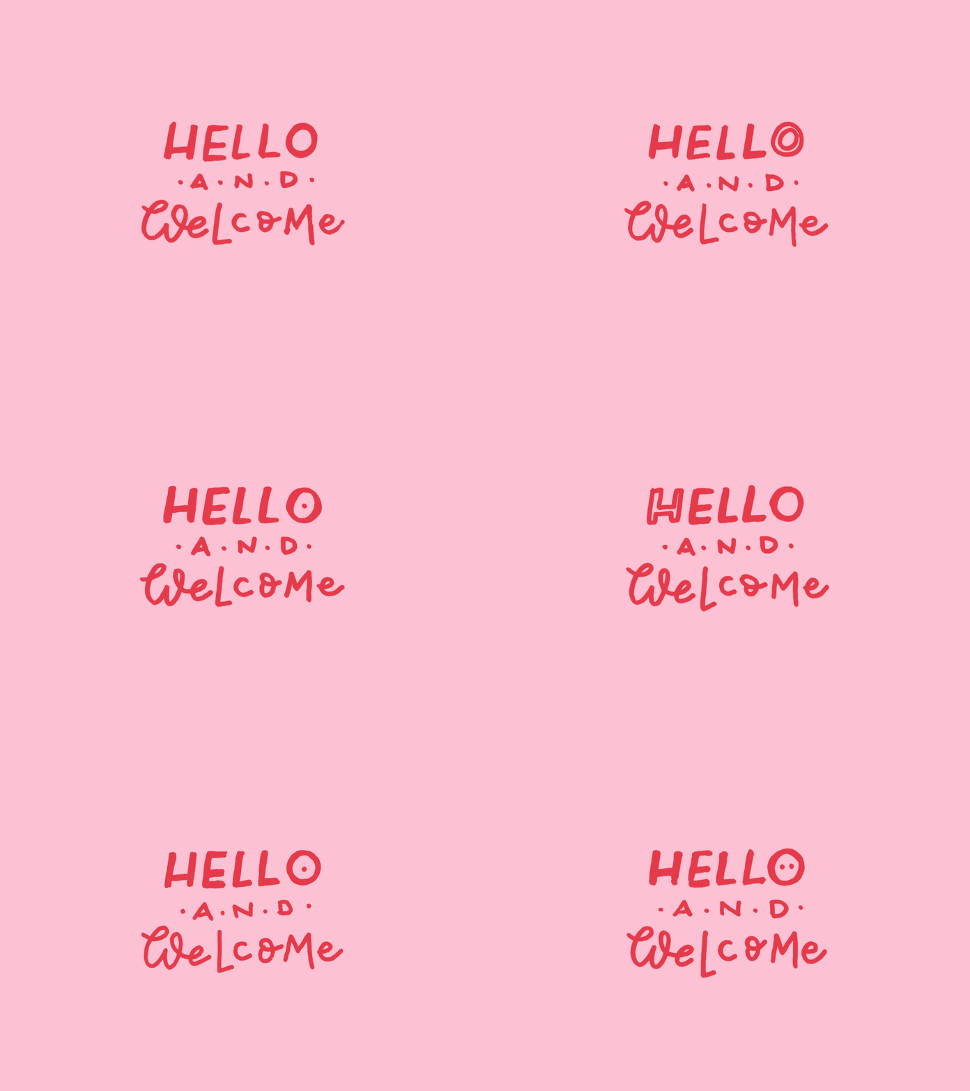
Hi Emilie! I love the color of your blog. I really like the soft color of the pink header and sides and how they have a nice contrast with yellow of the body. I've never heard of Hootsuite, I'm curious as to what it is and what it does. The show stopper for me is your animated Welcome sign. I need to learn how to do that! So cute and really captures your attention as soon as you click onto the blog. Great job!
ReplyDelete